How to Build a Website from Scratch?
Complete web development guide • Step-by-step explanations
Web Development Fundamentals:
Show Website Builder SimulatorBuilding a website from scratch involves creating all components yourself using programming languages like HTML, CSS, and JavaScript. This process gives you complete control over design, functionality, and performance.
At its core, web development combines three fundamental technologies:
- HTML: Structure and content of web pages
- CSS: Styling and visual presentation
- JavaScript: Interactivity and dynamic behavior
Modern web development also involves frameworks, version control, deployment, and optimization techniques. The process typically follows planning, design, development, testing, and deployment phases.
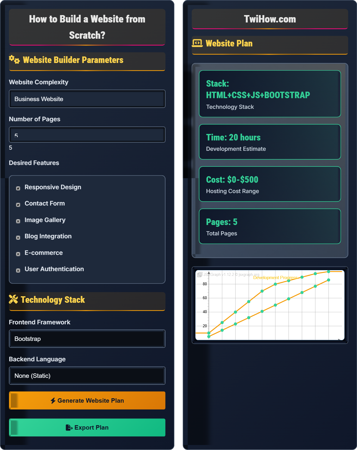
Website Builder Parameters
Technology Stack
Website Plan
How to Build a Website from Scratch
Web development is the process of creating websites and web applications that run on the internet. It encompasses all the activities involved in building, maintaining, and deploying websites, from simple static pages to complex web applications. Web development involves both client-side (frontend) and server-side (backend) programming, as well as database management and system architecture.
The foundation of web development rests on three core technologies:
Where:
- HTML: Defines the structure and content of web pages
- CSS: Controls the visual presentation and layout
- JavaScript: Adds interactivity and dynamic behavior
Web development is divided into two main areas:
- Frontend: Client-side development (HTML, CSS, JavaScript)
- Backend: Server-side development (databases, APIs, business logic)
- Full-Stack: Both frontend and backend development
- Version Control: Git and GitHub for code management
- Responsive Design: Mobile-first approach
- SEO Basics: Search engine optimization principles
- Performance: Optimization techniques
- Security: Best practices for secure development
- Testing: Quality assurance methodologies
Core Technologies
HTML provides the structure and content of web pages using tags and elements. It defines headings, paragraphs, links, images, forms, and other content blocks that browsers interpret to display information.
CSS controls the visual appearance of HTML elements, including colors, fonts, layouts, animations, and responsive design. It separates content from presentation, making sites maintainable and accessible.
JavaScript adds interactivity and dynamic behavior to websites. It handles user events, manipulates the DOM, makes API requests, validates forms, and creates rich user experiences.
Development Tools & Frameworks
Text editors, browsers, version control, and development environments.
Latest markup standard
Modern styling features
Modern JavaScript features
Responsive framework
Component-based UI
Progressive framework
Full-featured platform
Server-side JavaScript
Web Development Learning Quiz
Which of the following represents the correct basic HTML document structure?
The correct HTML document structure consists of an <html> element containing a <head> section (for metadata) and a <body> section (for content). The <head> must come before the <body> within the <html> element.
The answer is B) <html><head></head><body></body></html>.
Understanding HTML document structure is fundamental to web development. The <head> contains metadata, title, and resource links, while the <body> contains the visible content. This structure ensures browsers can properly parse and render web pages.
HTML Document: Structured markup document for web browsers
Head Element: Contains metadata and resource declarations
Body Element: Contains visible page content
• Head must come before body
• All content belongs in body
• Proper nesting is required
• Use HTML5 doctype declaration
• Always include meta charset
• Semantic elements improve accessibility
• Incorrect element nesting
• Missing required elements
• Improper closing tags
Explain the different types of CSS selectors and provide examples of when to use each type.
Type Selectors: Target HTML elements directly (e.g., p, div, h1). Use for general styling of all instances of an element.
Class Selectors: Target elements with specific class attributes (.className). Use for reusable styles across multiple elements.
ID Selectors: Target unique elements with specific IDs (#idName). Use for unique styling or JavaScript targeting.
Attribute Selectors: Target elements with specific attributes ([type="submit"]). Use for styling based on attribute values.
Pseudo-selectors: Target elements in specific states (:hover, :nth-child()). Use for dynamic or state-based styling.
CSS selectors determine which elements receive specific styles. Understanding selector specificity and when to use each type is crucial for efficient and maintainable CSS. Selectors form the bridge between HTML structure and visual presentation.
Selector Specificity: Method for determining which CSS rule applies
Class Selector: Targets elements with matching class attribute
ID Selector: Targets unique element with matching ID
• ID selectors have higher specificity
• Class selectors are reusable
• Type selectors affect all elements
• Use classes over IDs for styling
• Combine selectors for precision
• Understand specificity hierarchy
• Overusing ID selectors
• Not understanding specificity
• Poor selector naming
You're tasked with building a portfolio website for a freelance graphic designer. Describe the complete development process from planning to deployment, including the technologies you'd recommend and why.
Planning: Interview client to understand needs, target audience, and required sections (about, portfolio, contact).
Design: Create wireframes showing layout, then visual mockups focusing on showcasing portfolio images.
Development: Use HTML5 for structure, CSS3 with Flexbox/Grid for responsive layout, JavaScript for gallery functionality.
Recommended Tech: Bootstrap for responsive grid, Lightbox for image gallery, AOS for scroll animations.
Deployment: Host on Netlify or Vercel for free, fast deployment with custom domain support.
Successful web projects require systematic planning and appropriate technology choices. For a portfolio site, the focus should be on visual presentation and mobile responsiveness, with fast loading times and SEO optimization.
Wireframe: Schematic representation of page layout
Mockup: Visual design prototype
Portfolio Site: Website showcasing work and skills
• Prioritize visual content
• Optimize image loading
• Ensure mobile compatibility
• Use high-quality images
• Implement lazy loading
• Include social media links
• Poor image optimization
• Ignoring mobile experience
• Overcomplicating navigation
Explain how to implement responsive design using CSS, including the role of media queries, flexible grids, and scalable images. Why is responsive design crucial for modern websites?
Media Queries: Use @media rules to apply different styles based on screen size, orientation, or resolution. Example: @media (max-width: 768px) { ... }
Flexible Grids: Use CSS Flexbox or Grid with percentage-based widths instead of fixed pixels. Employ CSS variables for consistent spacing.
Scalable Images: Use max-width: 100% and height: auto to ensure images scale appropriately. Consider srcset for different resolutions.
Importance: Over 50% of web traffic comes from mobile devices. Responsive design ensures optimal user experience across all devices and improves SEO rankings.
Responsive design is not just about making websites look good on mobile—it's about ensuring functionality, usability, and accessibility across all devices. Modern CSS provides powerful tools for creating fluid, adaptable layouts.
Responsive Design: Approach to web design that adapts to different screen sizes
Media Queries: CSS feature to apply styles based on device characteristics
Mobile-First: Design strategy starting with mobile screens
• Design mobile-first approach
• Test on multiple devices
• Prioritize content hierarchy
• Use CSS Grid for complex layouts
• Implement touch-friendly navigation
• Optimize for performance
• Adding mobile styles as afterthought
• Not testing on actual devices
• Ignoring touch interactions
Which of the following is NOT a valid way to declare a variable in modern JavaScript?
JavaScript has three ways to declare variables: var (function-scoped), let (block-scoped), and const (block-scoped, immutable reference). The 'define' keyword does not exist in JavaScript for variable declaration. While 'var' is still valid, 'let' and 'const' are preferred in modern JavaScript.
The answer is D) define myVariable = 'value';.
Understanding variable declaration in JavaScript is fundamental. The choice between var, let, and const affects scope, hoisting, and mutability. Modern best practices favor let for mutable variables and const for immutable references.
Scope: Region of code where variable is accessible
Hoisting: JavaScript's behavior of moving declarations to top
Block Scope: Limited to {} block
• Prefer const over let when possible
• Avoid var in modern code
• Understand scope differences
• Use const for objects and arrays
• Declare variables close to usage
• Understand temporal dead zone
• Using var unnecessarily
• Reassigning const variables
• Not understanding block scope
Deployment & Hosting
Steps to publish your website online for public access.
Various platforms for publishing your website online.
Free Hosting
- GitHub Pages - Good for static sites
- Netlify - Excellent for modern web apps
- Vercel - Great for React/Next.js projects
Paid Hosting
- Bluehost - Beginner-friendly shared hosting
- SiteGround - Reliable performance
- AWS - Scalable cloud solutions
FAQ
Q: How long does it take to build a website from scratch?
A: The time varies greatly depending on complexity:
• Landing Page: 5-10 hours for beginners
• Business Site: 20-40 hours
• Portfolio: 15-30 hours
• E-commerce: 100+ hours
As you gain experience, development time decreases significantly. Focus on learning fundamentals first, then gradually tackle more complex projects.
Q: Should I learn frontend or backend development first?
A: Start with frontend development for several reasons:
1. Visual Feedback: You see immediate results in the browser
2. Foundation: Understanding HTML/CSS/JS is crucial for backend
3. Market Demand: Many opportunities for frontend developers
4. Progression: Easier to transition to backend after mastering frontend
Once you're comfortable with frontend technologies, you can explore backend development and eventually become a full-stack developer.
Q: What's the difference between a framework and a library?
A: The key difference lies in control and structure:
Library: Provides tools you call when needed (jQuery, Lodash). You control the flow of your application.
Framework: Provides structure you fill in (React, Angular, Vue). The framework controls the flow and calls your code.
Think of a library as a toolbox where you pick what you need, while a framework is like a house where you decorate the rooms. Frameworks are generally more opinionated and provide more structure.