What is CSS?
Complete CSS guide • Step-by-step explanations
CSS Fundamentals:
CSS BuilderCSS (Cascading Style Sheets) is a stylesheet language used to describe the presentation and formatting of HTML documents. It controls the visual appearance, layout, and positioning of web page elements.
CSS separates content (HTML) from presentation, enabling responsive design, consistent styling across pages, and improved accessibility. It allows developers to create beautiful, functional web experiences.
Key CSS concepts:
- Selectors: Target specific HTML elements
- Properties: Define visual characteristics
- Values: Specify property settings
- Layout: Control positioning and structure
CSS works alongside HTML and JavaScript to create modern, interactive web applications with responsive designs.
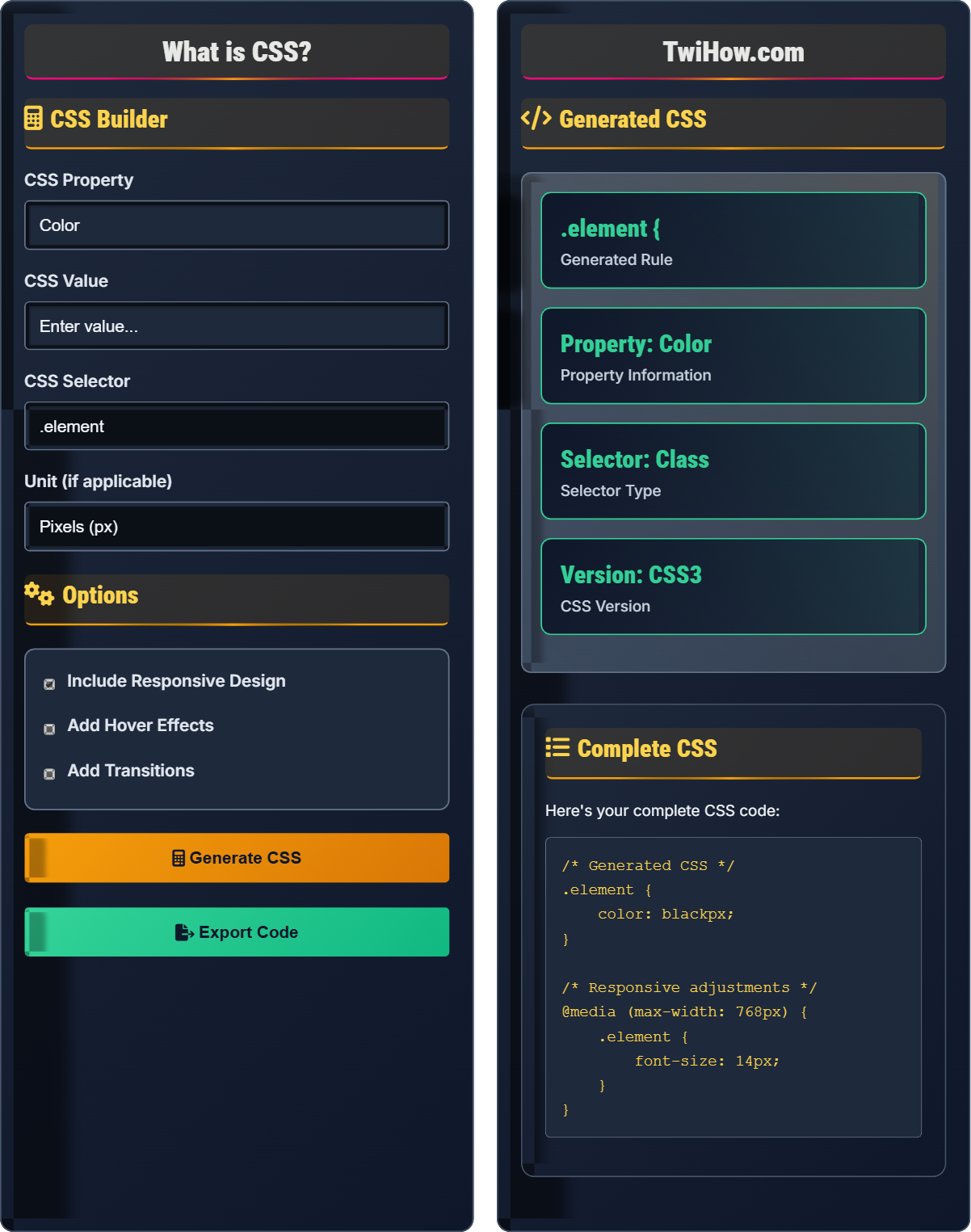
CSS Builder
Options
Generated CSS
Complete CSS
Here's your complete CSS code:
.element {
    color: black;
}| Property | Value | Category | Browser Support |
|---|---|---|---|
| color | black | Typography | Universal |
| background | white | Visual | Universal |
| font-size | 16px | Typography | Universal |
| padding | 10px | Layout | Universal |
Live Preview:
What is CSS Explained
CSS (Cascading Style Sheets) is a stylesheet language that describes the presentation of HTML documents. It controls the visual appearance, layout, and formatting of web pages, separating content from presentation.
CSS Rule = Selector + Declaration Block
For example: .class-name { color: blue; } where .class-name is selector, color is property, blue is value.
Essential CSS property categories:
- Typography: font-size, color, line-height, font-family
- Layout: display, position, float, flexbox, grid
- Visual: background, border, box-shadow, opacity
- Dimensions: width, height, padding, margin
- Transitions: transition, animation, transform
- Specificity: Use minimal specificity for maintainability
- Modularity: Organize CSS into logical modules
- Performance: Minimize repaints and reflows
- Responsiveness: Use relative units and media queries
CSS Fundamentals
Selectors, properties, values, specificity, cascade, inheritance, box model.
/* Basic CSS syntax */
selector {
    property: value;
    another-property: another-value;
}

/* Example */
.header {
    color: blue;
    font-size: 24px;
    text-align: center;
}- Separate content from presentation
- Use semantic class names
- Consider mobile-first approach
CSS Selectors
Element, class, ID, attribute, pseudo-class, pseudo-element selectors.
/* Element selector */
p {
    color: red;
}

/* Class selector */
.text-center {
    text-align: center;
}

/* ID selector */
#header {
    background-color: blue;
}

/* Attribute selector */
input[type="email"] {
    border: 2px solid #ccc;
}

/* Pseudo-class selector */
a:hover {
    color: green;
}- Specificity affects which rules apply
- Class selectors are more reusable than IDs
- Element selectors have lowest specificity
- Combine selectors for more specific targeting
CSS Knowledge Quiz
What does CSS stand for?
CSS stands for Cascading Style Sheets. The "cascading" part refers to the way CSS applies rules to elements in a specific order of precedence, where more specific rules override less specific ones.
CSS is a stylesheet language used to describe the presentation of HTML documents. It controls the visual appearance, layout, and formatting of web pages, separating content from presentation.
The answer is B) Cascading Style Sheets.
Think of CSS like the paint and decorations on a house. The HTML is the structure of the house, and CSS is what makes it look beautiful. The "cascading" part means that styles flow down from general rules to more specific ones, like water flowing down a waterfall.
Cascading: Rules flow from general to specific
Style Sheets: Files containing presentation instructions
Separation: Content from presentation
• CSS separates content from presentation
• Rules cascade from general to specific
• Multiple stylesheets can be linked
• Remember "Cascading" for the order of precedence
• CSS enhances HTML content
• Use external stylesheets for consistency
• Confusing CSS with HTML
• Not understanding the cascade concept
• Mixing content and presentation
Explain CSS specificity and how it determines which styles are applied to HTML elements. Include the calculation method and practical examples.
CSS Specificity Definition: CSS specificity is a scoring system that determines which CSS rule applies when multiple rules target the same element.
Calculation Method:
ID Selectors: 100 points
Class Selectors: 10 points
Element Selectors: 1 point
Example:
#header .nav a = 100 (ID) + 10 (Class) + 1 (Element) = 111 points
.navigation a = 10 (Class) + 1 (Element) = 11 points
The rule with higher specificity wins. If specificity is equal, the last declared rule wins.
Practical Impact: Understanding specificity helps avoid conflicts and predict which styles will apply to elements.
Think of specificity like a ranking system - the rule with the highest "score" wins. IDs are worth the most points, classes are worth medium points, and element selectors are worth the least.
Specificity: CSS rule priority system
Selector: Part of CSS rule that targets elements
Cascade: Order in which styles are applied
• ID selectors have highest specificity
• Class selectors have medium specificity
• Element selectors have lowest specificity
• Use classes over IDs when possible
• Keep specificity low for maintainability
• Use !important sparingly
• Overusing ID selectors
• Not understanding cascade order
• Excessive use of !important
You're creating a responsive navigation menu and need to implement a mobile-friendly design. Design the CSS structure using appropriate selectors, properties, and media queries for a navigation that transforms from horizontal to vertical at smaller screen sizes. Explain your approach.
Recommended Structure:
/* Base navigation styles */
.navbar {
    background-color: #333;
    padding: 1rem;
}

.nav-list {
    list-style: none;
    margin: 0;
    padding: 0;
    display: flex;
    justify-content: space-around;
}

.nav-link {
    color: white;
    text-decoration: none;
    padding: 0.5rem 1rem;
    display: block;
}

/* Mobile styles */
@media (max-width: 768px) {
    .nav-list {
        flex-direction: column;
    }

    .nav-link {
        padding: 0.75rem;
        border-bottom: 1px solid #555;
    }
}

/* Responsive navigation */
@media (max-width: 480px) {
    .navbar {
        padding: 0.5rem;
    }

    .nav-link {
        padding: 1rem;
        text-align: center;
    }
}
Approach: Use flexbox for horizontal layout, media queries to change layout at breakpoints, and ensure touch-friendly sizing for mobile devices.
This approach uses mobile-first design principles. The navigation starts as a vertical list on small screens and becomes horizontal as the screen gets larger. Flexbox provides the flexibility to easily switch between layouts.
Responsive Design: Layouts that adapt to screen size
Flexbox: CSS layout model for flexible containers
Media Query: CSS rule for conditional styling
• Use relative units (rem, em, %)
• Implement touch-friendly navigation
• Test on actual devices
• Use CSS Grid for complex layouts
• Set viewport meta tag
• Optimize for performance
• Fixed width layouts
• Not testing on mobile devices
• Poor touch target sizing
Compare CSS layout methods: floats, flexbox, and grid. Explain when to use each method and provide specific examples of appropriate use cases for each.
Floats:
Use Cases: Text wrapping around images, simple two-column layouts
Pros: Good browser support, simple for basic layouts
Cons: Difficult to clear, not designed for complex layouts
Example: Float images within paragraphs
Flexbox:
Use Cases: One-dimensional layouts (rows or columns), navigation bars, card components
Pros: Excellent for alignment, distribution of space, responsive design
Cons: Limited to one dimension at a time
Example: Centering elements vertically and horizontally
Grid:
Use Cases: Two-dimensional layouts, complex page structures
Pros: Powerful for complex layouts, precise control over rows and columns
Cons: Newer technology, slightly more complex syntax
Example: Magazine-style layouts with multiple rows and columns
Conclusion: Use Grid for complex page layouts, Flexbox for component layouts and alignment, and floats only for legacy support.
Think of these layout methods as different tools for different jobs. Grid is like a blueprint for an entire building, Flexbox is like arranging furniture in a room, and floats are like placing small decorative elements. Choose the right tool for the specific layout challenge.
Float: CSS property for wrapping content around elements
Flexbox: One-dimensional layout model
Grid: Two-dimensional layout system
• Use Grid for page-level layouts
• Use Flexbox for component-level layouts
• Choose method based on dimensional needs
• Grid and Flexbox can be used together
• Learn Grid for modern layouts
• Understand the dimensional difference
• Using floats for complex layouts
• Using Grid for simple alignment
• Not understanding dimensional differences
Which CSS unit is best for responsive design when you want elements to scale relative to their parent's font size?
The em unit is best for responsive design when you want elements to scale relative to their parent's font size. 1em equals the computed font-size of the element's parent, making it scalable based on the parent's context.
While rem is also relative to font size, it's always relative to the root element's font size, not the parent. Pixels are fixed units that don't scale, and percentages are relative to the containing block's dimensions, not font size.
For example, if a parent element has a font-size of 16px, then 1em would equal 16px for child elements.
The answer is B) em.
Think of em like a multiplier based on the parent's font size. If the parent has a font size of 16px, then 2em would be 32px. This creates a proportional relationship that scales with the parent's size.
em: Relative to parent's font size
rem: Relative to root element's font size
px: Absolute pixel measurement
• Use em for scaling relative to parent
• Use rem for consistent scaling
• Use relative units for responsive design
• em scales with parent font size
• rem scales with root font size
• Consider accessibility with relative units
• Using px for responsive design
• Confusing em and rem
• Not considering nesting effects
FAQ
Q: How do I link CSS to HTML?
A: You can link CSS to HTML in three ways:
External CSS: Use the <link> tag in the <head>: <link rel="stylesheet" href="styles.css">
Internal CSS: Use the <style> tag in the <head>: <style>body { color: black; }</style>
Inline CSS: Use the style attribute: <div style="color: black;">Content</div>
External stylesheets are preferred for maintainability and reusability.
Q: What's the difference between CSS Grid and Flexbox?
A: CSS Grid is a two-dimensional layout system that works with rows and columns simultaneously, making it ideal for complex page layouts. Flexbox is a one-dimensional layout system that works in a single direction (either row or column), making it perfect for component-level layouts and alignment.
Grid is best for overall page structure (like a magazine layout), while Flexbox excels at distributing space and aligning items within a container (like a navigation bar or card component).