How Do I Optimize My App for Different Screen Sizes and Devices?
Complete responsive design guide • Step-by-step explanations
Responsive Design Fundamentals:
Show Responsive SimulatorResponsive design is the practice of building websites and applications that adapt seamlessly to different screen sizes and devices. This involves using flexible grids, media queries, scalable images, and adaptive layouts to ensure optimal user experience across desktops, tablets, and mobile devices.
The core principle is to create a single codebase that responds intelligently to various viewports, orientations, and device capabilities. This eliminates the need for separate mobile and desktop versions while ensuring consistent functionality and aesthetics.
Key responsive design techniques:
- Flexible Grids: Using relative units like percentages and ems
- Media Queries: CSS rules that apply based on screen characteristics
- Scalable Images: Images that resize appropriately
- Mobile-First Approach: Starting with mobile layouts and enhancing for larger screens
Modern responsive design also considers touch interactions, performance optimization, and accessibility to create truly inclusive experiences across all devices.
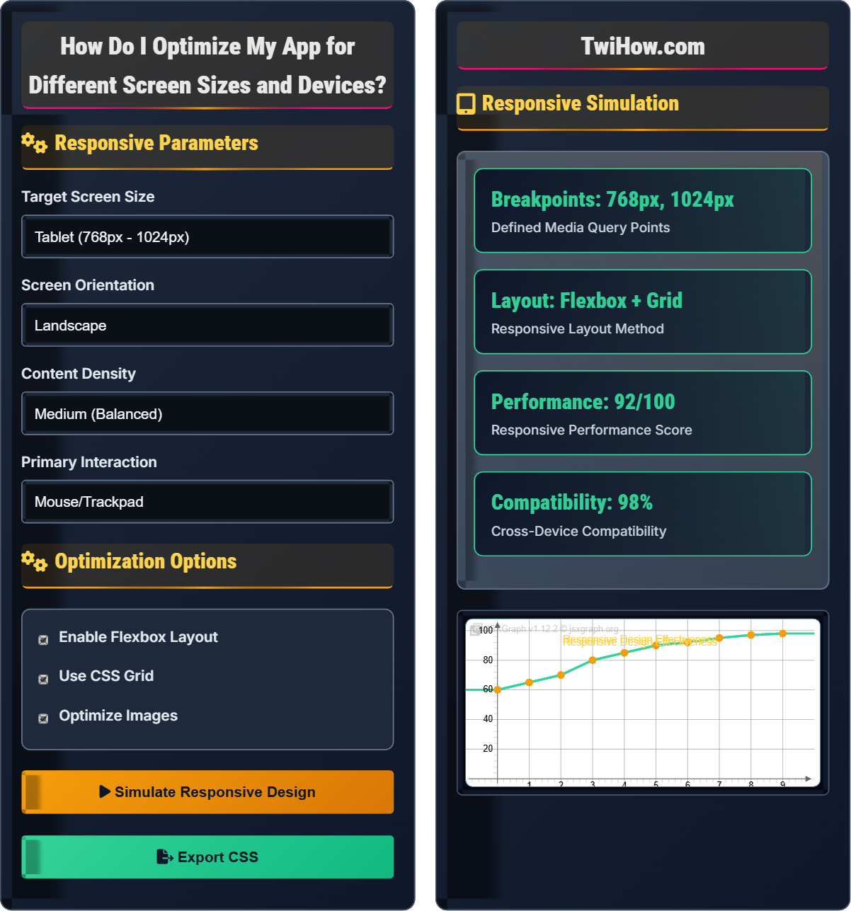
Responsive Parameters
Optimization Options
Responsive Simulation
#app {
  display: flex;
  flex-wrap: wrap;
  gap: 1rem;
}

@media (max-width: 768px) {
  #app {
    flex-direction: column;
  }

  .card {
    width: 100%;
  }
}

@media (min-width: 769px) and (max-width: 1024px) {
  .card {
    width: calc(50% - 0.5rem);
  }
}

@media (min-width: 1025px) {
  .card {
    width: calc(33.333% - 0.667rem);
  }
}
Responsive Design Explained
Responsive design is an approach to web design that makes web pages render well on a variety of devices and window or screen sizes. The goal is to provide an optimal viewing and interaction experience—easy reading and navigation with a minimum of resizing, panning, and scrolling.
Core Principles:
- Fluid Grids: Layouts that use relative units instead of fixed pixels
- Flexible Images: Images that scale within their containing element
- Media Queries: CSS rules that apply different styling based on device characteristics
Responsive design effectiveness can be measured using this formula:
Where:
- Elements Adapted: Number of UI elements that adjust to screen size
- Total Elements: Total number of UI elements
- Devices Supported: Number of successfully supported devices
- Target Devices: Total number of target devices
- Performance Factor: Page load speed and rendering efficiency
Standard responsive breakpoints used in modern web design:
- Mobile: 320px - 480px (Smartphones)
- Small Tablet: 481px - 768px (iPad portrait)
- Large Tablet: 769px - 1024px (iPad landscape)
- Desktop: 1025px - 1200px (Laptops)
- Large Desktop: 1201px+ (Wide screens)
- CSS Grid: Two-dimensional layout system for complex designs
- Flexbox: One-dimensional layout for flexible containers
- Viewport Units: vw, vh, vmin, vmax for relative sizing
- Picture Element: Serve different images based on device capabilities
- Lazy Loading: Load content as needed to improve performance
- Progressive Enhancement: Start with basic functionality and add features
Responsive Design Fundamentals
Media queries, flexible grids, scalable images, breakpoints, mobile-first approach, CSS Grid, Flexbox.
Adaptability = (Flexible Grid × Media Queries) / (Fixed Elements)
Where Flexible Grid = relative units (%, em, rem), Media Queries = CSS rules for different screens.
- Start with mobile-first approach
- Use relative units over fixed pixels
- Test on actual devices regularly
Implementation Best Practices
Breakpoint planning, grid systems, image optimization, performance testing, accessibility compliance.
- Define target devices and use cases
- Establish core breakpoints
- Implement flexible grid systems
- Add media query enhancements
- Optimize assets for each breakpoint
- Test across all target devices
- Performance impact of responsive images
- Touch vs. mouse interaction differences
- Accessibility across all devices
- Content prioritization on smaller screens
Responsive Design Learning Quiz
Which CSS property is used to define different styles for different screen sizes?
The @media CSS at-rule is used to define different style rules for different media types/devices. It allows you to specify CSS rules that apply only when certain conditions are met, such as screen width, height, orientation, or device type.
The answer is B) @media.
Media queries are the foundation of responsive design. They allow you to create conditional CSS rules based on various characteristics of the device or viewport. Common media features include width, height, orientation, and device-pixel-ratio. This enables you to create layouts that adapt to different screen sizes without changing the underlying HTML structure.
Media Query: CSS technique to apply styles based on device characteristics
Breakpoint: Specific screen size where layout changes
Viewport: Visible area of a web page on a device
• Use max-width for mobile-first approach
• Define breakpoints based on content, not devices
• Test media queries in actual browsers
• Start with base styles for smallest screens
• Use relative units like rem and em
• Combine multiple media features
• Using fixed pixel widths instead of relative units
• Creating too many unnecessary breakpoints
• Not testing on actual devices
Explain the mobile-first approach to responsive design and describe its advantages over desktop-first design.
Mobile-First Approach: Starting with the smallest screen size and progressively enhancing the design for larger screens. This means creating the base styles for mobile devices and then using media queries to add enhancements for tablets, desktops, and larger screens.
Advantages:
1. Performance: Starts with minimal CSS and adds features progressively, reducing initial payload.
2. Focus: Forces prioritization of essential content and functionality.
3. Scalability: Makes it easier to add features for larger screens.
4. Modern Usage: Aligns with current mobile-first browsing trends.
Implementation: Use min-width media queries to progressively enhance the design: @media (min-width: 768px) { /* tablet styles */ }
This approach results in cleaner, more maintainable code that prioritizes performance and user experience.
The mobile-first approach is a paradigm shift from traditional web design. Instead of designing for the largest possible screen and trying to squeeze it down, you start with the most constrained environment. This forces you to think critically about what's truly essential for your users, leading to cleaner, more focused designs. The progressive enhancement philosophy ensures that all users get a functional experience, with additional features added for those with larger screens.
Mobile-First: Designing for small screens first, then enhancing
Progressive Enhancement: Adding features as capabilities increase
Graceful Degradation: Starting with full features and removing for constraints
• Start with base mobile styles
• Use min-width for mobile-first
• Enhance rather than fix
• Design for the smallest viewport first
• Use relative units consistently
• Test early and often on mobile devices
• Starting with desktop layout and shrinking
• Not considering mobile touch interactions
• Ignoring mobile performance
A news website has a main content area, sidebar, and footer. On mobile, the layout should be stacked vertically. On tablet, the sidebar should appear below the main content. On desktop, the sidebar should appear to the right of the main content. Describe the CSS approach to achieve this responsive layout using Flexbox.
CSS Approach:
Base (Mobile) Styles:
#main-container { display: flex; flex-direction: column; }
Tablet Styles:
@media (min-width: 768px) { #main-container { flex-direction: column; } #sidebar { order: 2; } #content { order: 1; } }
Desktop Styles:
@media (min-width: 1024px) { #main-container { flex-direction: row; } #content { flex: 1; } #sidebar { flex: 0 0 300px; } }
Explanation: The flex-direction property controls the layout flow. On mobile, the default column direction stacks elements vertically. On tablet, we maintain column direction but use the order property to position the sidebar below the content. On desktop, changing to row direction places the sidebar to the right of the content. The flex property on desktop allows the content area to take up remaining space while fixing the sidebar width.
This example demonstrates the power of Flexbox for responsive layouts. The key insight is that Flexbox properties like flex-direction, order, and flex-grow can be changed at different breakpoints to dramatically alter the layout without changing the HTML structure. This approach is much more maintainable than having separate HTML for different screen sizes.
Flexbox: CSS layout method for flexible container arrangements
flex-direction: Controls main axis direction (row/column)
order: Changes visual order of flex items
• Use flexbox for one-dimensional layouts
• Change flex-direction at breakpoints
• Consider content priority in source order
• Use flex-wrap for responsive wrapping
• Combine with CSS Grid for complex layouts
• Test all breakpoints thoroughly
• Mixing flexbox and float positioning
• Not considering source order for accessibility
• Using fixed heights that break responsiveness
An e-commerce site has product images that need to look crisp on both standard and high-resolution displays while maintaining fast loading times. The images should scale appropriately on mobile, tablet, and desktop. What responsive image techniques would you implement and why?
Responsive Image Techniques:
1. Srcset Attribute: Provide multiple image resolutions: <img srcset="image-320w.jpg 320w, image-640w.jpg 640w, image-1280w.jpg 1280w" src="image-640w.jpg">
2. Sizes Attribute: Define image size relative to viewport: sizes="(max-width: 480px) 100vw, (max-width: 768px) 50vw, 33vw"
3. Picture Element: For different image formats or art direction: <picture><source media="(max-width: 768px)" srcset="mobile-image.jpg"><img src="desktop-image.jpg"></picture>
4. Modern Formats: Use WebP with fallbacks for older browsers.
5. Lazy Loading: Implement loading="lazy" attribute for below-the-fold images.
Rationale: These techniques ensure optimal image delivery based on device capabilities, screen size, and resolution while maintaining performance through appropriate file sizes.
Responsive images are crucial for performance and user experience. The srcset and sizes attributes work together to allow the browser to select the most appropriate image based on the device's capabilities and the image's display size. This prevents downloading unnecessarily large images on small screens while ensuring high-resolution displays get sharp images. The picture element provides even more control for complex scenarios.
Srcset: Provides multiple image sources for different resolutions
Sizes: Defines how the image size relates to the viewport
Art Direction: Showing different images based on context
• Always provide fallback images
• Optimize images for web delivery
• Consider bandwidth limitations
• Use image compression tools
• Implement progressive JPEGs
• Consider using a CDN for images
• Using same image for all devices
• Not providing proper fallbacks
• Ignoring file size impact
Which CSS unit is most appropriate for creating responsive layouts that scale with the viewport size?
For truly responsive layouts, relative units are essential. Percentages scale relative to parent containers, rem units scale relative to the root font size, and em units scale relative to the parent element's font size. Pixels are fixed units that don't scale with viewport size. Viewport units (vw, vh) also scale with viewport size and are particularly useful for responsive layouts.
The answer is D) All of the above except px.
Responsive layouts rely on relative units that adapt to different contexts. While percentages are relative to parent containers, rem and em units provide more predictable scaling based on font sizes. Viewport units (vw, vh) directly relate to the viewport dimensions, making them ideal for responsive sizing. The combination of these units allows for complex, adaptive layouts that respond appropriately to different screen sizes.
Relative Units: Units that scale based on context
rem: Relative to root element font size
em: Relative to parent element font size
• Use relative units for responsive layouts
• Combine different relative units strategically
• Maintain consistent typography scaling
• Set root font size in % for easy scaling
• Use clamp() for fluid typography
• Test with different zoom levels
• Using fixed pixel values for layout dimensions
• Mixing relative and absolute units inconsistently
• Not considering font size scaling
FAQ
Q: What's the difference between adaptive and responsive design?
A: The key differences are:
Responsive Design: Uses flexible grids and media queries to adapt to any screen size. A single fluid layout adjusts continuously.
Adaptive Design: Uses fixed layout sizes that change at specific breakpoints. Multiple fixed layouts for different devices.
Responsive Advantages: More flexible, fewer maintenance points, better for unknown devices.
Adaptive Advantages: More precise control over specific device experiences, potentially better performance.
Modern web development favors responsive design due to the wide variety of device sizes and the impracticality of designing for every possible screen dimension.
Q: How do I handle touch interactions differently from mouse interactions in responsive design?
A: Touch and mouse interactions require different considerations:
Touch Targets: Minimum 44px×44px for touch devices to ensure usability.
Hover States: Not available on touch devices; use focus states for accessibility.
Gesture Support: Implement swipe, pinch, and tap gestures where appropriate.
Scrolling: Touch devices use momentum scrolling; avoid custom scrollbars.
Form Inputs: Use appropriate input types (email, tel) for better mobile keyboards.
Testing: Always test touch interactions on actual devices, not just simulators.
Consider progressive enhancement - ensure functionality works without hover-dependent features.