What is Accessibility in Web Development and How Do I Implement It?
Complete accessibility guide • Step-by-step implementation
Web Accessibility:
Show Accessibility AnalyzerWeb accessibility ensures that websites, tools, and technologies are designed and developed so that people with disabilities can use them. This includes individuals with auditory, cognitive, neurological, physical, speech, and visual disabilities. Accessibility is not just about compliance but about creating inclusive experiences for all users.
Implementing accessibility involves following standards like WCAG (Web Content Accessibility Guidelines) and using proper semantic HTML, ARIA attributes, and assistive technology considerations. The goal is to provide equivalent experiences for users with different abilities and assistive technologies.
Key aspects of web accessibility:
- Semantic HTML: Proper use of HTML elements for meaning
- Keyboard Navigation: Full functionality without mouse
- Screen Reader Support: Compatibility with assistive technologies
- Color Contrast: Adequate contrast ratios for visibility
- Alternative Text: Descriptive content for non-text elements
Modern web accessibility combines technical implementation with user experience design to create truly inclusive digital experiences.
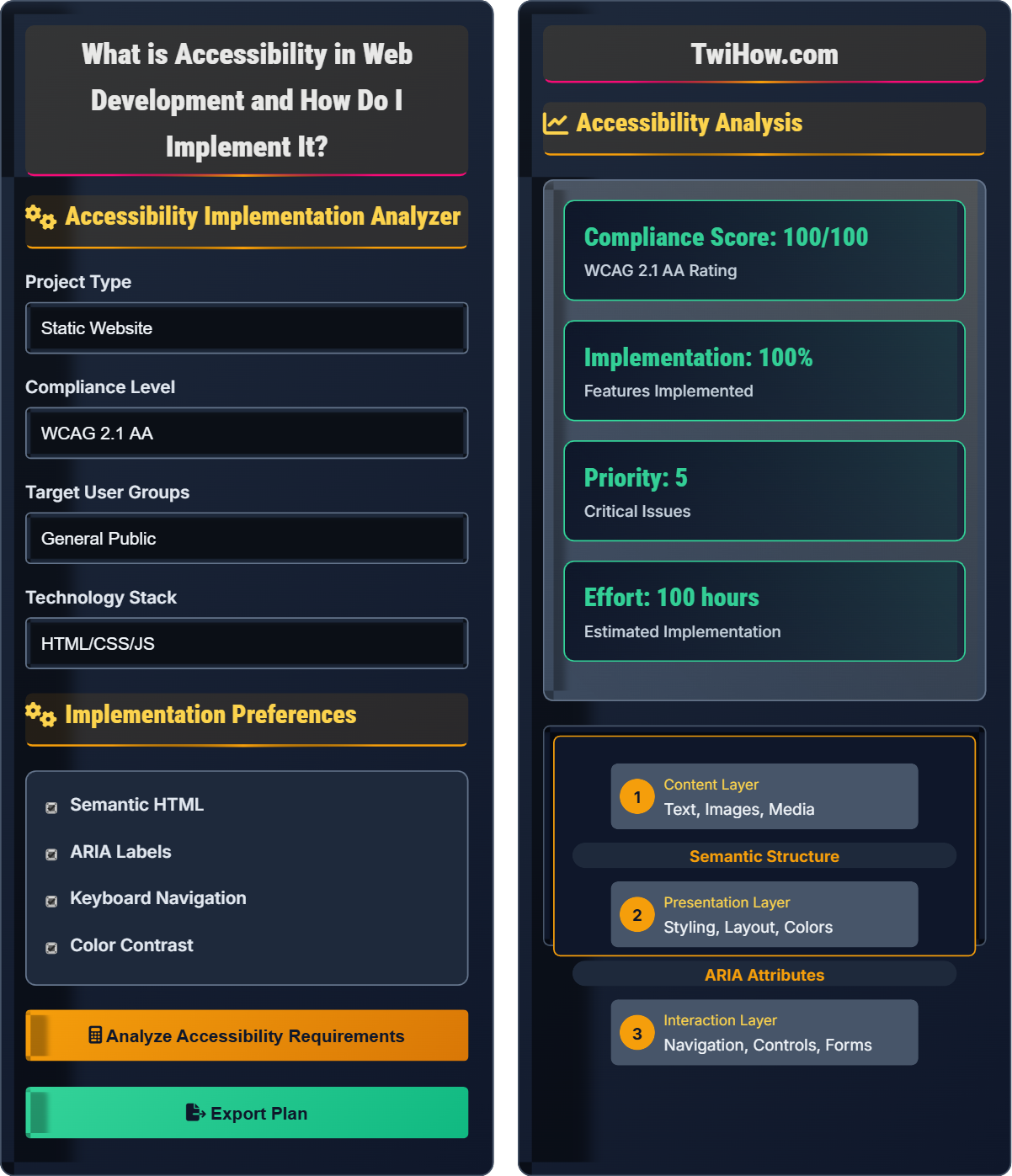
Accessibility Implementation Analyzer
Implementation Preferences
Accessibility Analysis
Accessibility Requirements
Based on your inputs, the following accessibility requirements apply:
- Proper heading structure (h1-h6) for content hierarchy
- Alternative text for all meaningful images
- Sufficient color contrast ratios (4.5:1 minimum)
- Keyboard navigable interface
- ARIA labels for interactive elements
- Form labels and instructions
These requirements ensure compliance with WCAG 2.1 AA standards.
| Test Type | Tool | Frequency |
|---|---|---|
| Automated Scanning | axe-core, Lighthouse | Daily |
| Keyboard Testing | Manual Testing | Per Feature |
| Screen Reader | NVDA, VoiceOver | Weekly |
| Color Contrast | Contrast Checker | Continuous |
Web Accessibility Fundamentals
Web accessibility is built on four foundational principles known as POUR:
Where:
- Perceivable: Information must be presentable in ways users can perceive
- Operable: Interface components must be operable by all users
- Understandable: Information and UI operation must be understandable
- Robust: Content must be robust enough for various assistive technologies
WCAG 2.1 AA guidelines encompass three levels of conformance:
- Level A: Basic accessibility features for most users
- Level AA: Standard level for most organizations (legal compliance)
- Level AAA: Highest level of accessibility (specialized cases)
Each guideline addresses specific user needs across different disability categories including visual, auditory, motor, and cognitive impairments.
Most frequent accessibility problems:
- Missing Alternative Text: Images without proper descriptions
- Poor Color Contrast: Insufficient contrast ratios
- Keyboard Traps: Inability to navigate away from elements
- Empty Links: Clickable elements without discernible names
- Missing Form Labels: Inputs without associated labels
- Improper Heading Structure: Inconsistent or missing heading hierarchy
- Progressive Enhancement: Build core functionality first, then enhance
- User Testing: Include users with disabilities in testing
- Automated Testing: Integrate accessibility checks into CI/CD
- Training: Educate team members on accessibility principles
- Documentation: Maintain accessibility requirements and decisions
- Continuous Monitoring: Regular audits and updates
Accessibility Fundamentals
WCAG, ARIA, semantic HTML, assistive technology, screen readers, keyboard navigation, color contrast.
Success = (Proper Semantics × User Testing) / (Technical Barriers × Cognitive Load)
Where Proper Semantics = HTML Structure + ARIA, User Testing = Feedback + Iteration.
- Use semantic HTML elements appropriately
- Ensure all functionality is keyboard accessible
- Maintain adequate color contrast ratios
Implementation Strategies
Accessibility tools, testing frameworks, semantic HTML, ARIA attributes, keyboard navigation, assistive technology compatibility.
- Set up accessibility testing tools and processes
- Train development team on accessibility standards
- Implement semantic HTML structure
- Add ARIA labels and attributes where needed
- Test keyboard navigation and focus management
- Verify color contrast and visual presentation
- Time investment for accessibility implementation
- Team training and skill development requirements
- Regular testing and maintenance needs
- Legal compliance requirements
Accessibility Quiz
Which of the following is the most appropriate semantic HTML element for a page's main content area?
The most appropriate semantic HTML element for a page's main content area is the <main> element. This element specifically identifies the primary content of a page, making it clear to assistive technologies what the main focus of the page should be. Screen readers can jump directly to the main content, improving navigation for users with disabilities.
<div> is not semantic, <section> is for thematic grouping, and <article> is for self-contained content.
The answer is B) <main>.
Semantic HTML is crucial for accessibility because it provides meaning and structure to content. Assistive technologies like screen readers rely on semantic elements to understand and navigate content. The <main> element specifically indicates the primary content of a page, which is different from headers, footers, or navigation. This semantic meaning allows assistive technologies to provide shortcuts and better navigation to users with disabilities.
Semantic HTML: Elements that convey meaning about content
Assistive Technology: Tools that help users with disabilities
Screen Reader: Software that reads content aloud
• Use appropriate semantic elements
• Maintain proper heading hierarchy
• Provide alternative text for images
• Use landmarks like main, nav, header
• Structure headings logically (h1-h6)
• Test with a screen reader
• Using divs for everything
• Skipping heading levels
• Not considering assistive technology
Explain when and how to use ARIA (Accessible Rich Internet Applications) labels in web development, including specific examples of appropriate use cases.
When to Use ARIA:
1. Enhancing Existing Semantics: When HTML semantics are insufficient to convey meaning. Example: Adding aria-describedby to connect explanatory text to form inputs.
2. Dynamic Content: For content that changes without page reloads. Example: Using aria-live regions to announce updates.
3. Custom Widgets: For custom interactive elements that don't have native semantics. Example: ARIA roles for custom dropdown menus.
4. State Management: To indicate the state of interactive elements. Example: aria-expanded for collapsible sections.
Specific Examples:
Form Labels: <input type="text" aria-label="Search for products">
Live Regions: <div aria-live="polite">Shopping cart updated</div>
Modal Dialogs: <div role="dialog" aria-modal="true" aria-labelledby="modalTitle">
Landmark Roles: <div role="banner"></div> (though semantic HTML is preferred)
Important Rule: Use ARIA only when native HTML semantics are insufficient. The order of preference is: native HTML → ARIA → CSS/JavaScript. ARIA should enhance, not replace, semantic HTML.
ARIA is a set of attributes that enhance accessibility for dynamic web applications. However, it should be used judiciously. The first rule of ARIA is "Don't use ARIA" if native HTML elements already provide the necessary semantics. ARIA is most valuable for complex, dynamic interfaces that go beyond what standard HTML can express. The goal is to provide equivalent experiences for users of assistive technologies.
ARIA: Accessible Rich Internet Applications
Roles: ARIA attributes that define element purpose
States: ARIA attributes that describe element conditions
• Use native HTML first, ARIA when necessary
• ARIA should enhance, not replace semantics
• Test with assistive technologies
• Use aria-label for invisible labels
• Use aria-describedby for additional info
• Test with screen readers regularly
• Overusing ARIA when HTML is sufficient
• Incorrect ARIA attribute combinations
• Not testing with actual assistive technologies
Your web application includes a custom dropdown menu that opens on hover. A user who navigates exclusively with a keyboard cannot access the menu options. How would you implement proper keyboard navigation for this component to ensure accessibility?
Keyboard Navigation Implementation:
1. Focus Management: Ensure the dropdown trigger element is focusable (typically a button) and receives keyboard focus.
2. Keyboard Events: Implement handlers for Enter, Space, Arrow keys, and Escape:
• Enter/Space: Toggle dropdown visibility
• Arrow Keys: Navigate between menu items
• Escape: Close dropdown and return focus to trigger
3. Focus Trapping: When dropdown is open, trap focus within menu items until closed.
4. ARIA Attributes: Use appropriate roles and states:
<button aria-haspopup="true" aria-expanded="false">Menu</button>
<ul role="menu" aria-hidden="true"></ul>
<li role="menuitem" tabindex="-1">Item</li>
5. Visual Focus Indicators: Ensure visible focus rings for keyboard users.
Example Implementation:
button.addEventListener('keydown', (e) => {
if (e.key === 'Enter' || e.key === ' ') {
toggleDropdown();
e.preventDefault();
}
});
This approach ensures that keyboard-only users have equivalent access to functionality.
Keyboard navigation is essential because many users cannot or choose not to use a mouse. This includes users with motor disabilities, those using screen readers, and power users who prefer keyboard shortcuts. When implementing custom components, you must replicate the keyboard interactions that native elements provide. Focus management is crucial - users need to know where they are on the page and be able to navigate predictably.
Focus Management: Controlling keyboard focus flow
Focus Ring: Visual indicator of focused element
Focus Trapping: Restricting focus to specific area
• All interactive elements must be keyboard accessible
• Provide visible focus indicators
• Maintain logical tab order
• Test with keyboard only
• Use focus management libraries
• Consider skip links for navigation
• Assuming all users use a mouse
• Not providing focus indicators
• Breaking natural tab order
Your design team wants to use a light gray text (#cccccc) on a white background (#ffffff) for body text. The text is 16px Arial font. Calculate the contrast ratio and determine if it meets accessibility standards. If not, suggest alternatives that would comply with WCAG requirements.
Contrast Ratio Calculation:
Using the WCAG contrast ratio formula:
Contrast Ratio = (L1 + 0.05) / (L2 + 0.05)
Where L1 is the relative luminance of the lighter color and L2 is the darker color.
For #ffffff (white): L = 1.0
For #cccccc (light gray): L = 0.59
Contrast Ratio = (1.0 + 0.05) / (0.59 + 0.05) = 1.05 / 0.64 = 1.64:1
WCAG Compliance:
• WCAG AA requires 4.5:1 for normal text (16px)
• WCAG AA requires 3:1 for large text (18px+ or bold 14px+)
The 1.64:1 ratio does NOT meet WCAG AA standards.
Compliant Alternatives:
• Use #767676 (contrast ratio: 4.55:1) - Meets AA standard
• Use #666666 (contrast ratio: 5.07:1) - Better than minimum
• Use #555555 (contrast ratio: 5.85:1) - Exceeds AA
Additional Considerations:
• Background textures or gradients affect contrast
• Font weight and family impact readability
• Test with actual users when possible
Always verify contrast ratios using tools like WebAIM's Contrast Checker to ensure compliance.
Color contrast is critical for users with visual impairments, including color blindness, low vision, and age-related vision changes. The contrast ratio calculation accounts for how the human eye perceives brightness differences. WCAG standards provide minimum thresholds that ensure text remains readable under various conditions. The formula considers the relative luminance of colors, which is more accurate than simple RGB differences.
Contrast Ratio: Mathematical measure of color difference
Relative Luminance: Brightness relative to white
WCAG AA: Standard level of accessibility compliance
• Normal text: minimum 4.5:1 contrast
• Large text: minimum 3:1 contrast
• Use contrast checking tools
• Use WebAIM Contrast Checker
• Consider background textures
• Test with grayscale view
• Relying on visual judgment only
• Not accounting for background patterns
• Using insufficient contrast for small text
Which of the following is the most important consideration for screen reader compatibility?
The most important consideration for screen reader compatibility is providing meaningful text alternatives for non-text content. Screen readers convert visual content into speech or Braille, so they need text equivalents for images, videos, charts, and other non-text elements. This includes alt text for images, captions for videos, and descriptions for complex visual information.
While other factors like semantic HTML structure and keyboard navigation are also crucial, meaningful text alternatives form the foundation of screen reader compatibility by ensuring that all content can be conveyed through text.
The answer is B) Providing meaningful text alternatives for non-text content.
Screen readers work by interpreting the text and structure of a webpage to convey information to users who cannot see the visual content. They rely heavily on text alternatives to make non-text content accessible. Alt text for images, captions for videos, and descriptive labels for interactive elements are fundamental to creating an equivalent experience for screen reader users. This is why alternative text is often considered the most basic requirement for web accessibility.
Screen Reader: Software that converts text to speech
Alternative Text: Text describing non-text content
Equivalent Experience: Same information and functionality
• Every meaningful image needs alt text
• Decorative images should have empty alt
• Complex images need detailed descriptions
• Write alt text for the context, not the image
• Use longdesc for complex images
• Test with actual screen readers
• Leaving alt attributes empty when content is meaningful
• Using generic alt text like "image"
• Not providing transcripts for audio content
FAQ
Q: How do I balance accessibility requirements with design aesthetics?
A: Accessibility and design aesthetics are not mutually exclusive. In fact, accessible design often results in better user experiences for everyone. Focus on inclusive design principles from the beginning rather than retrofitting accessibility. Ensure sufficient color contrast, maintain clear visual hierarchies, and design focus states that are both functional and aesthetically pleasing. Many accessibility features like clear typography and logical layouts improve usability for all users. The key is viewing accessibility as a design constraint that can inspire creative solutions rather than a limitation.
Q: What tools should we use to test accessibility?
A: Use a combination of automated and manual testing tools: 1) Automated: axe-core, Lighthouse, WAVE for initial scans. 2) Browser extensions: axe, WAVE, Accessibility Insights. 3) Screen readers: NVDA (Windows), VoiceOver (Mac/iOS), JAWS. 4) Color contrast checkers: WebAIM Contrast Checker, Stark. 5) Keyboard testing: Navigate your entire site using only Tab, Shift+Tab, Enter, and arrow keys. Remember that automated tools catch only about 30% of accessibility issues, so manual testing and user feedback are essential. Integrate accessibility checks into your CI/CD pipeline for continuous monitoring.
Q: What are the legal implications of not making our website accessible?
A: There are significant legal risks for inaccessible websites. In the US, the ADA (Americans with Disabilities Act) applies to websites, and there have been hundreds of lawsuits filed annually against businesses with inaccessible sites. Section 508 requires federal agencies to make electronic content accessible. Internationally, similar laws exist (EU Web Accessibility Directive, UK Equality Act). Beyond legal compliance, there are financial implications: potential fines, legal fees, remediation costs, and lost business. Many organizations now treat accessibility as a risk management issue. The cost of making a site accessible during development is significantly less than retrofitting after launch or facing legal action.